Color is an essential element of branding and marketing that can significantly impact consumer behavior. Different colors evoke various emotions and can influence how people perceive your brand, making it crucial to understand the psychology of color. In this section, we will explore the impact of color on branding and marketing.
The Basics of Color Psychology
Color psychology is the study of how different colors affect human behavior. It is a crucial aspect of branding and marketing, as colors can evoke various emotions and influence consumer behavior. Understanding the psychology of color can help you choose the right colors for your brand and create a strong emotional connection with your audience.
Colors can be broadly classified into warm and cool colors. Warm colors include red, orange, and yellow, while cool colors include blue, green, and purple. Warm colors are associated with energy, excitement, and passion, while cool colors are associated with calmness, relaxation, and trustworthiness.
The Impact of Colors on Branding and Marketing
Red
Red is a powerful and attention-grabbing color that is associated with passion, energy, and excitement. It is often used in marketing to create a sense of urgency or to promote products that evoke strong emotions. Brands that use red in their branding include Coca-Cola, Netflix, and YouTube.
Orange
Orange is a warm and inviting color that is associated with creativity, enthusiasm, and warmth. It is often used in marketing to create a sense of playfulness or to promote products that are fun. Brands that use orange in their branding include Nickelodeon, Fanta, and Harley-Davidson.
Yellow
Yellow is a bright and cheerful color that is associated with happiness, optimism, and friendliness. It is often used in marketing to create a sense of positivity or to promote products that are associated with happiness. Brands that use yellow in their branding include McDonald’s, Best Buy, and Nikon.
Green
Green is a calming and refreshing color that is associated with growth, health, and nature. It is often used in marketing to create a sense of relaxation or to promote products that are eco-friendly. Brands that use green in their branding include Whole Foods, Animal Planet, and Starbucks.
Blue
Blue is a calming and trustworthy color that is associated with stability, trust, and calmness. It is often used in marketing to create a sense of security or to promote products that are reliable. Brands that use blue in their branding include Facebook, American Express, and Ford.
Purple
Purple is a royal and luxurious color that is associated with creativity, luxury, and sophistication. It is often used in marketing to create a sense of elegance or to promote high-end products. Brands that use purple in their branding include Cadbury, Hallmark, and Yahoo.
Black
Black is a powerful and sophisticated color that is associated with elegance, power, and authority. It is often used in marketing to create a sense of exclusivity or to promote high-end products. Brands that use black in their branding include Chanel, Rolls-Royce, and Mont Blanc.
White
White is a pure and innocent color that is associated with simplicity, cleanliness, and clarity. It is often used in marketing to create a sense of purity or to promote simplicity. Brands that use white in their branding include Apple, Nike, and Dove.
Pink
Pink is a feminine and playful color that is associated with romance, love, and happiness. It is often used in marketing to create a sense of femininity or to promote products that are targeted towards women. Brands that use pink in their branding include Barbie, Victoria’s Secret, and T-Mobile.
Brown
Brown is a warm and earthy color that is associated with nature, stability, and reliability. It is often used in marketing to create a sense of warmth or to promote products that are associated with the outdoors. Brands that use brown in their branding include UPS, Timberland, and M&M’s.
Gray
Gray is a neutral and sophisticated color that is associated with professionalism, elegance, and formality. It is often used in marketing to create a sense of sophistication or to promote products that are associated with business or formal events. Brands that use gray in their branding include Mercedes-Benz, Apple, and Adobe.
Gold
Gold is a luxurious and prestigious color that is associated with wealth, prosperity, and success. It is often used in marketing to create a sense of exclusivity or to promote high-end products or services. Brands that use gold in their branding include Rolex, American Express, and Cadillac.
Silver
Silver is a modern and sleek color that is associated with innovation, sophistication, and elegance. It is often used in marketing to create a sense of modernity or to promote products that are associated with technology or design. Brands that use silver in their branding include Samsung, Mercedes-Benz, and Audi.
Other Colors
Apart from the colors mentioned above, there are other colors that can be used in branding and marketing. For instance, turquoise is a color that is associated with tranquility, while peach is associated with femininity and sweetness. Coral is associated with fun and excitement, while lavender is associated with relaxation and calmness.
Case Study: Psychology of Color in Branding and Marketing of 30 Unique Global Companies
Color plays a significant role in branding and marketing strategies as it has the power to evoke emotions, influence perception, and enhance brand recognition. In this comprehensive case study, we will delve into the psychology of color in the branding and marketing efforts of 30 unique and globally recognized companies. By analyzing their color choices and understanding their potential psychological effects, we can gain deeper insights into how these companies strategically leverage color to communicate their brand identity, connect with their target audiences, and establish a competitive edge in their respective industries.
Methodology
To conduct this case study, we conducted a thorough analysis of the branding and marketing materials of 30 globally recognized companies from various industries, including technology, food and beverage, retail, and entertainment. We focused on their logos, website designs, product packaging, and advertisements to understand the consistent use of color and its potential impact on consumer perception and brand recognition. Additionally, we conducted research to explore the underlying psychological associations and cultural meanings attached to different colors.
Findings:
- Apple: Apple’s branding primarily uses black, a color often associated with simplicity, class, and innovation. The choice of black aligns with their brand identity of clean and classy design, appealing to their target market of tech-savvy individuals seeking sophisticated and user-friendly products. Black also symbolizes the seamless integration and user experience that Apple strives to provide across its range of devices and services.

Apple Logo - Coca-Cola: The Coca-Cola logo is predominantly red, which is known to evoke strong emotions such as excitement, passion, and energy. The strategic use of red helps Coca-Cola create a sense of urgency and stimulate consumers’ thirst, making it an iconic color in the beverage industry. Red also symbolizes the brand’s dynamic personality and its commitment to creating refreshing and enjoyable moments for its consumers.

CocaCola Logo - Google: Google’s logo features a combination of primary colors: blue, green, yellow, and red. This playful use of colors reflects their brand identity as a vibrant, diverse, and creative company, appealing to a wide range of users across different demographics. Each color in Google’s logo represents a specific aspect of their business, with blue symbolizing reliability and trustworthiness, green representing growth and innovation, yellow conveying optimism and friendliness, and red adding a touch of excitement and energy.

Google Logo - McDonald’s: McDonald’s iconic golden arches are primarily yellow, a color associated with happiness, optimism, and appetite stimulation. The use of yellow in their branding and packaging helps create a warm and inviting atmosphere, encouraging customers to associate positive emotions with their fast-food experience. Yellow also symbolizes the brand’s commitment to providing a joyful and satisfying dining experience for customers of all ages.

McDonald’s Logo - Facebook: Facebook’s logo prominently features the color blue, which conveys trust, reliability, and professionalism. Blue is also associated with communication and technology, aligning with Facebook’s mission of connecting people worldwide through its social media platform. The use of blue helps establish Facebook as a trustworthy and credible platform for sharing information and fostering meaningful connections.

Facebook Logo - Nike: Nike’s logo uses the color black, symbolizing power, strength, and sophistication. Black creates a sense of exclusivity and luxury, appealing to athletes and individuals seeking high-performance and stylish athletic wear. Black also represents the brand’s commitment to excellence and its ability to empower individuals to push their limits and achieve their goals.

Nike Logo - Amazon: Amazon’s logo combines the colors black and orange. Black conveys reliability and authority, while orange evokes energy and enthusiasm. This combination suggests Amazon’s commitment to delivering a seamless and exciting online shopping experience. The use of black also signifies the brand’s vast product range and its ability to cater to diverse customer needs, while orange adds a vibrant and approachable touch to the brand’s identity.

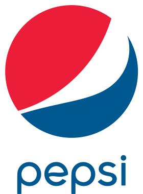
Amazon Logo - Pepsi: Pepsi’s branding revolves around a red, white, and blue color scheme. Red and blue evoke excitement and trust, respectively, while white adds a sense of purity and cleanliness. This combination creates a strong visual impact, positioning Pepsi as a competitive rival to Coca-Cola. The use of red, white, and blue also conveys a sense of patriotism and American heritage, appealing to a wide audience.
Pepsi Logo - Target: Target’s logo prominently features the color red, which signifies excitement, energy, and affordability. Red helps create a sense of urgency and draws attention to their products, while also communicating a strong brand identity. The use of red in Target’s branding conveys the brand’s commitment to providing a lively and affordable shopping experience, enticing customers to explore their wide range of products.

Target Logo - Starbucks: Starbucks utilizes a deep shade of green in its logo and store designs. Green is associated with freshness, growth, and relaxation, aligning with Starbucks’ commitment to offering high-quality, sustainably sourced coffee in a cozy and inviting atmosphere. Green also symbolizes the brand’s connection to nature and its dedication to ethical practices, resonating with environmentally conscious consumers.

Starbucks Logo - Microsoft: Microsoft’s logo predominantly features the color blue, representing trust, reliability, and professionalism. Blue is commonly associated with technology and software companies, indicating Microsoft’s dedication to providing dependable and user-friendly products. The use of blue also creates a sense of familiarity and comfort, making Microsoft’s offerings more approachable for a wide range of users.

Microsoft Logo - Instagram: Instagram’s logo combines vibrant shades of pink, purple, orange, and yellow. These colors evoke feelings of creativity, inspiration, and joy, reflecting the platform’s focus on visual storytelling and connecting individuals through shared experiences. The use of these lively colors captures the essence of the diverse content shared on Instagram and creates a visually appealing and engaging platform for users.

Instagram Logo Note: Use TwoOrbit’s AI Instagram Hashtags Generator for free to boost your Instagram marketing.
- BMW: BMW’s logo features a black circle with white and blue segments. Blue signifies reliability and trust, while white conveys purity and elegance. Together, these colors communicate BMW’s commitment to producing high-quality, luxurious, and innovative automobiles. The use of blue also represents the brand’s focus on cutting-edge technology and performance, setting BMW apart as a symbol of status and success.

BMW Logo - FedEx: FedEx utilizes a combination of purple and orange in its logo. Purple represents creativity, royalty, and trust, while orange conveys enthusiasm and energy. This color combination communicates FedEx’s commitment to reliable and efficient package delivery services. The use of purple and orange also creates a distinctive visual identity for the brand, making it easily recognizable and memorable in a competitive industry.

FedEx Logo - IBM: IBM’s logo predominantly features blue, representing trust, dependability, and innovation. As a technology company, the use of blue helps establish credibility and reinforces the company’s brand image as a leader in the industry. Blue also conveys a sense of professionalism and reliability, qualities that are highly valued in the corporate world. IBM’s blue color choice aligns with their mission of providing innovative solutions and cutting-edge technologies to businesses worldwide.

IBM Logo - Twitter: Twitter’s logo features a blue bird, which aligns with the company’s brand identity as a platform for open communication and information sharing. Blue signifies trust, reliability, and transparency, appealing to users seeking real-time updates and engagement. The use of a bird in the logo also conveys a sense of freedom and connectivity, reflecting Twitter’s role as a medium for people to connect, share ideas, and stay informed.

Twitter Logo - Disney: Disney’s branding heavily utilizes the color red, which represents excitement, passion, and adventure. Red is often associated with strong emotions, making it an ideal choice for a company that focuses on creating magical and memorable experiences for both children and adults. The use of red in Disney’s branding evokes a sense of wonder and nostalgia, reinforcing the brand’s association with joy, entertainment, and enchantment.

Disney Logo - UPS: UPS’s logo features a combination of brown and gold. Brown symbolizes reliability, stability, and dependability, while gold adds a touch of elegance and premium quality. This color combination reflects UPS’s commitment to delivering packages promptly and securely. The use of brown also signifies the brand’s long-standing presence in the industry and its ability to handle logistics with utmost care and precision.

UPS Logo - Adobe: Adobe’s logo predominantly features a vibrant shade of red, which represents passion, creativity, and energy. Red is commonly associated with the arts and design, aligning with Adobe’s software products for graphic design, photography, and video editing. The use of red in Adobe’s branding conveys the brand’s dedication to empowering creative professionals and inspiring innovation in the digital realm.

Adobe Logo - Toyota: Toyota’s logo combines red and white. Red symbolizes passion, energy, and excitement, while white conveys purity and reliability. This color combination communicates Toyota’s commitment to manufacturing high-quality, performance-driven vehicles. The use of red also represents the brand’s dynamic and adventurous spirit, appealing to individuals seeking reliable and exhilarating driving experiences.

Toyota Logo - Spotify: Spotify’s branding predominantly uses a vibrant shade of green, representing growth, freshness, and harmony. Green also has calming effects and aligns with Spotify’s mission of providing users with a personalized and soothing music streaming experience. The use of green reflects Spotify’s commitment to connecting users with their favorite music and creating a harmonious environment for music lovers worldwide.

Spotify Logo - Intel: Intel’s logo features a combination of blue and white. Blue represents trust, reliability, and professionalism, while white conveys simplicity and innovation. This color combination reinforces Intel’s position as a leading technology company. The use of blue and white signifies the brand’s dedication to producing advanced and cutting-edge solutions while ensuring the highest standards of quality and performance.

intel Logo - Volkswagen: Volkswagen’s logo primarily uses blue, representing trust, reliability, and loyalty. Blue also aligns with the automotive industry’s associations of stability and safety, reflecting Volkswagen’s commitment to engineering excellence and high-quality manufacturing. The use of blue in Volkswagen’s branding creates a sense of trust and reliability, positioning the brand as a dependable choice for car enthusiasts worldwide.

Volkswagon Logo - Airbnb: Airbnb’s logo predominantly features the colors black and white. Black symbolizes elegance, sophistication, and exclusivity, while white conveys simplicity, purity, and cleanliness. This color combination reflects Airbnb’s brand identity as a provider of unique and luxurious accommodation options. The use of black and white also creates a visually striking and minimalist design, capturing the essence of the brand’s commitment to offering exceptional travel experiences.

Airbnb Logo - PayPal: PayPal’s logo predominantly features blue, representing trust, security, and reliability. Blue is a widely recognized color in the financial industry, signifying stability and professionalism. The use of blue in PayPal’s branding reinforces the brand’s commitment to ensuring safe and seamless online transactions, establishing trust among its users and positioning PayPal as a reputable and secure payment solution.

PayPal Logo - Honda: Honda’s logo primarily uses blue, representing reliability, trustworthiness, and a sense of harmony. Blue is a common color choice in the automotive industry, signifying quality and dependability. The use of blue in Honda’s branding conveys the brand’s commitment to producing reliable and innovative vehicles while creating a sense of tranquility and confidence in their customers.

Honda Logo - Gucci: Gucci’s logo features a combination of black and gold. Black represents power, luxury, and sophistication, while gold adds a touch of opulence and exclusivity. This color combination communicates Gucci’s position as a high-end and prestigious fashion brand. The use of black and gold signifies the brand’s commitment to timeless elegance, impeccable craftsmanship, and creating a sense of luxury for their discerning clientele.

Gucci Logo - LinkedIn: LinkedIn’s logo prominently features the color blue, representing trust, professionalism, and reliability. Blue is commonly associated with corporate environments, aligning with LinkedIn’s focus on professional networking and career development. The use of blue in LinkedIn’s branding conveys a sense of credibility and authority, making it an ideal platform for individuals and businesses to connect, collaborate, and establish professional relationships.

Linkedin Logo - Mastercard: Mastercard’s logo combines the colors red and yellow. Red symbolizes passion, excitement, and energy, while yellow represents optimism and friendliness. This color combination creates a visually appealing and dynamic design, capturing Mastercard’s brand identity as a global payment solution provider. The use of red and yellow also conveys a sense of convenience, reliability, and instant transactions, making Mastercard an essential part of consumers’ everyday lives.

Mastercard Logo - Zara: Zara’s branding primarily uses the color black, representing elegance, sophistication, and timelessness. Black symbolizes luxury and high-end fashion, aligning with Zara’s position as a leading global fashion retailer. The use of black in Zara’s branding conveys a sense of exclusivity and quality, appealing to fashion-forward individuals seeking stylish and trendy clothing options.

Zara Logo
Conclusion
Color is a powerful tool in branding and marketing that can significantly impact consumer behavior. By understanding the psychology of color and using it effectively, you can create a strong emotional connection with your audience and drive more engagement and sales for your brand. Remember to choose colors that are relevant to your brand personality and values, and use them consistently across all your branding and marketing materials.
Frequently Asked Questions Related to Psychology of Color in Branding and Marketing
[faq-schema id=”3718″]
![]()