Top 20 Car Logos Of All Time
Pay attention to that sleek badge on your favorite automobile. It’s more than a shape or color. It’s a statement that draws you in. Iconic car logos tap into dreams, goals, and a love for motoring unlike any other. Feel the spark when you see that emblem? That’s brand magic at work, telling stories that span generations.
The desire for these badges runs deep. From muscle cars roaring through city streets to elegant European machines gliding down highways, those symbols mean pride and distinction. You want that connection. You want that thrill.
Act on that passion. Admire their bold shapes. Reflect on your favorite brand. Get ready to explore 20 timeless emblems that have fueled countless road trips, races, and collector obsessions.
History and Evolution of Car Logos
Early automakers understood the power of a strong emblem. People needed a quick way to recognize a brand from afar. Those first symbols were often simple monograms or stylized initials. Over time, car badges gained complexity. Designers added shields, animals, and other visual cues. National colors sometimes played a part, hinting at a brand’s heritage.
Shapes evolved to reflect changing design preferences. Periods of bold geometry and Art Deco flair led to intricate crests. Later decades embraced minimalism and sleek lines. That shift aligned with changing consumer tastes and fresh marketing strategies. Iconic car logos adapted to new eras. Yet they held fast to core brand values.
Some updated badges reflect changes in technology or a push for futuristic looks. Electric car companies, for instance, favor clean, modern lines. This blending of history and modern aesthetics creates familiarity and excitement. Long-standing names maintain original outlines or color schemes. Younger brands experiment with simpler forms that resonate with a tech-savvy audience.
Across decades, these symbols captured brand stories. They connected with drivers through shared ideals of power, style, or innovation. Today, iconic car logos spark conversations and remind us that design is never static. It always grows with the times.
Elements of Car Logos
Strong automotive emblems tend to share common threads. Shapes are key. Circles, shields, or stylized letters create lasting impact. Straight lines and sharp angles often suggest precision, while smooth curves hint at grace or speed.
Color choices add character. Many iconic car logos use black or silver for a classy feel. Others prefer red or blue for energy and trust. Splashes of gold convey luxury and status. Subtle hints of national flags show roots and pride.
Typography tells its own story. Some logos feature ornate scripts reflecting long histories. Others lean on blocky sans-serif text for modern appeal. Balance is vital. A design that’s too complex can lose clarity. Something too plain may not stand out enough. Designers strive for a sweet spot where each element speaks.
Symbolism also matters. Animals, shapes from nature, or mythological figures highlight deeper brand traits. These details help connect a logo to stories of endurance, speed, or craftsmanship. They strike an emotional chord with fans worldwide.
From subtle shading to bold outlines, each choice reflects a brand’s promise. That’s why iconic car logos feel so familiar. They blend color, form, and meaning into designs that speak volumes at a glance.
Top 20 Car Logos of All Time
Car enthusiasts often debate which badges deserve the spotlight. These 20 stand out for style, heritage, and that undeniable spark of recognition. Each one is a visual icon in its own right. Let’s discover what makes them shine.

1. Mercedes-Benz
The three-pointed star emerged in the early 1900s. It symbolizes dominance on land, sea, and air. Wrapped in a sleek ring, it exudes elegance and engineering excellence. Over decades, it rarely changed. That consistent presence built trust and loyalty. No wonder so many consider it among the most iconic car logos.
2. Ferrari
The prancing horse on a canary-yellow shield remains a powerful image. It traces back to wartime aviation, where a heroic pilot once displayed it on his plane. Enzo Ferrari adopted it for luck. Today, it represents speed, luxury, and Italian motor racing heritage.
3. Lamborghini
The raging bull matches Ferruccio Lamborghini’s star sign and his love of Spanish bullfights. Placed within a shield of black and gold, it projects unstoppable energy. That charging posture mirrors the raw might of each Lamborghini on the road.
4. Ford Mustang
A galloping horse that runs free. Introduced in the mid-1960s, the Mustang logo symbolized power and American spirit. Many see it as rebellious and exciting. That chrome pony still excites loyal fans of this legendary pony car.
5. Porsche
Look at the intricate crest. It features a rearing horse, antlers, and bold stripes. It points to the city of Stuttgart and the region of Württemberg. That combination projects prestige and top-tier German engineering. Over the years, slight tweaks kept it fresh without losing its core identity.
6. BMW
The blue-and-white quadrants reflect Bavarian origins. Some interpret it as an airplane propeller due to the brand’s roots in aviation. Official statements suggest it’s simply the state colors. Either way, it stands out among iconic car logos for its clarity and bold circle shape.
7. Audi
Four interlinked rings represent the merger of four companies: Audi, DKW, Horch, and Wanderer. This symbol highlights unity and progress. Over time, the brand gained fame for Quattro all-wheel drive and advanced tech. The rings remain a hallmark of modern precision.
8. Volkswagen
Created in 1937, the stacked V and W inside a circle has gone through subtle updates. It stands for the “people’s car” in German. Simple shapes and clean lines make it easy to recognize from any distance. That clarity helped VW find acceptance across continents.
9. Jaguar
The leaping feline soared onto bonnets in the mid-20th century. It denotes agility, luxury, and a flair for British style. Modern updates keep the cat refined. This is one of those iconic car logos that radiates class and power in equal measure.
10. Chevrolet Bowtie
Believed to be inspired by wallpaper or a newspaper ad, the bowtie shape arrived in 1913. Its exact origin remains debated. Through many color schemes, the outline stayed the same. It helped Chevy become a leader in American automotive design and production.
11. Ford Oval
Henry Ford’s scripted name inside a blue oval may be one of the oldest marks still in use. The swirl and distinctive lettering have remained nearly unchanged since 1903. That unwavering identity makes it a mainstay in the global automotive scene.
12. Tesla
This emblem captures the cross-section of an electric motor. Launched in 2003, Tesla redefined the electric car market. Its T shape is sleek, modern, and an unmistakable symbol of forward-thinking power. Tesla’s rise shows how new brands can create iconic car logos.
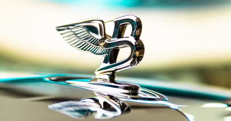
13. Bentley Wings
Two wings frame a bold B. It channels speed and aspiration. Bentley began in 1919, focusing on high-end craftsmanship and luxury racing. That aim is clear in the brand’s soaring emblem. It suggests movement and grace in one refined badge.
14. Abarth
The scorpion emblem matches the zodiac sign of founder Carlo Abarth. The shield backed with red and yellow pays tribute to Italian racing colors. Its small yet fierce vibe suits the tuning and racing spirit that Abarth is known for.
15. Alfa Romeo
The emblem splits into a red cross and a serpent figure. Those symbols connect to Milanese history. It offers a dash of medieval flair, hinting at Italian passion and performance. That blend of past and present makes it unforgettable.
16. Shelby Cobra
Carroll Shelby put the coiled cobra on his high-performance roadsters. It represents speed, danger, and a bit of American bravado. Whether displayed on a classic AC Cobra or later Shelby Mustangs, that snake warns rivals on the track.
17. Dodge Viper
The Viper brand arrived in the early 1990s with a fanged snake head. Over the years, the emblem evolved through versions like “Sneaky Pete” and “Fang.” Each version’s fierce attitude echoes the raw horsepower under the hood.
18. Rover Viking Ship
The British marque used a Viking longship to honor local heritage. It suggests journeys and exploration. Through modern updates, it kept that adventurous spirit. Even though Rover underwent big changes, this badge still resonates with classic motoring fans.
19. Saab
Rooted in Swedish aerospace engineering, Saab placed a griffin head (shared with Scania) on its roundel. That mythical creature symbolizes watchfulness. When Saab became fully automotive, the brand simplified the logo. Yet the griffin remains an icon of Swedish innovation.
20. Maserati Trident
Drawn from Neptune’s statue in Bologna, it projects power and Italian artistry. The three-pronged spear fits the Maserati brothers’ pursuit of triumph in racing and design. Luxury car enthusiasts recognize it instantly, linking it to grand touring and passion.
These 20 examples demonstrate how shape, history, and meaning merge to create something memorable. From bold animals to clean typography, iconic car logos capture hearts worldwide. Each emblem stands as a milestone in automotive storytelling. Every time a driver sees one of these logos, memories and emotions often follow.
Creative Design Tips for Making Car Logos
Designing a car emblem can be an exciting challenge. A few practical pointers can spark that perfect concept.
Keep shapes clean and recognizable. Crowded elements might look busy from a distance. Simple outlines tend to stay in memory. Pick a balanced palette. Darker tones can hint at elegance, while brighter hues suggest energy. Text can be part of the design or stand-alone. Minimal typography in synergy with the graphic can form a powerful statement.
Symbolism can help the brand story. Animals, geometric shapes, or stylized initials often link to values like speed, luxury, or innovation. Small details, like wing elements or subtle shading, can add depth without complicating things.
Test the design in various sizes. A strong emblem should look sharp on a car grille, a website header, or a smartphone icon. This consistency forms brand trust. A balanced mix of color, shape, and meaning paves the way for a memorable mark.
Mistakes to Avoid When Making Car Logos
Some designs miss the mark and end up feeling flat. Too much detail is often the culprit. Tiny elements can vanish when scaled down. A busy design can confuse potential buyers. Bold, clean shapes usually have a stronger impact.
Overly trendy styles might lose relevance once the fad passes. A design that leans on short-term trends can age quickly. Timeless logos typically rely on clear lines and classic imagery. Another mistake is poor color choices. Clashing hues or random gradients may distract from the central message.
Ignoring brand identity can be a problem. A sleek race-inspired badge might not suit a family-friendly brand. A name that promises comfort might need softer lines or gentler tones. Mismatched imagery can leave customers unsure about what the brand stands for.
Neglecting clarity is another pitfall. If it’s unclear whether the emblem shows a specific animal or letter, viewers might not connect with it. Aim for a design that speaks clearly, even when printed in small sizes or seen from afar.
How to Make Timeless Car Logos
Timeless logos endure changes in fashion and technology. Clear geometry stands strong across generations. Think of iconic car logos like the Ford Oval. That simple shape and signature script remain fresh decades after launch.
Cohesive symbolism strengthens long-term appeal. The prancing horse for Ferrari links directly to power and agility. Its shape, color, and stance never feel outdated. Timeless badges often favor minimal shading and strong contrasts. An emblem that relies on heavy gradients could look dated if printing or digital trends shift.
Designers sometimes blend tradition with subtle updates. Look at how BMW refreshes its emblem. They maintain the circular form yet tweak thickness or color saturation. That honors history while staying current. Public loyalty grows when fans see the brand’s respect for its roots.
A consistent message fosters trust. A brand known for performance might keep bold lines and sharp angles. One known for comfort might favor softer shapes and gentler hues. The best approach is to convey core values in a design that feels clear and resilient over time.
Why Use Logome.AI for Creating Modern Car Logos
Brands need designs that speak clearly. Logome.AI steps up by offering a free AI-powered logo maker. It’s been recognized on Product Hunt, ranking #5 Product of the Day. Over 800K logos and 200K brand kits have come to life using this platform.
Logome.AI simplifies every phase. A user picks from fonts, colors, and design styles. The AI then generates fresh concepts. Those who want an entire brand kit can get social media templates, website designs, and more. Many iconic car logos started with strong ideas. Logome.AI helps new creators uncover that spark in minutes.
No design background? That’s okay. The tool focuses on ease of use. In just a few steps, an automotive startup or personal project can secure a polished emblem. It’s quick, intuitive, and built for modern branding needs.
Conclusion
Car badges represent emotion, heritage, and promise. They hold stories of founders, national pride, and motorsports glory. Iconic car logos shape how drivers bond with brands. They decorate racetrack winners and daily commuters alike.
These emblems remind us that strong design carries meaning far beyond a simple badge. It travels with fans for years. It adds dimension to each drive, whether it’s a joyride or a work commute. That’s why brands invest in logos that feel timeless yet fresh.
Think about the next car you see. Notice its symbol. Let that spark of recognition and history fill you with admiration for the art of automotive branding.
Iconic Car Logos FAQs
[faq-schema id=”22391″]

I’m the cofounder of TwoOrbits.com and love to write about digital marketing, SEO, technology, DIY hacks and more. Share your feedbacks and suggestions via comment. Connect with me via LinkedIn and lets start an insightful conversation.
Author
Mohit
I'm the cofounder of TwoOrbits.com and love to write about digital marketing, SEO, technology, DIY hacks and more. Share your feedbacks and suggestions via comment. Connect with me via LinkedIn and lets start an insightful conversation.